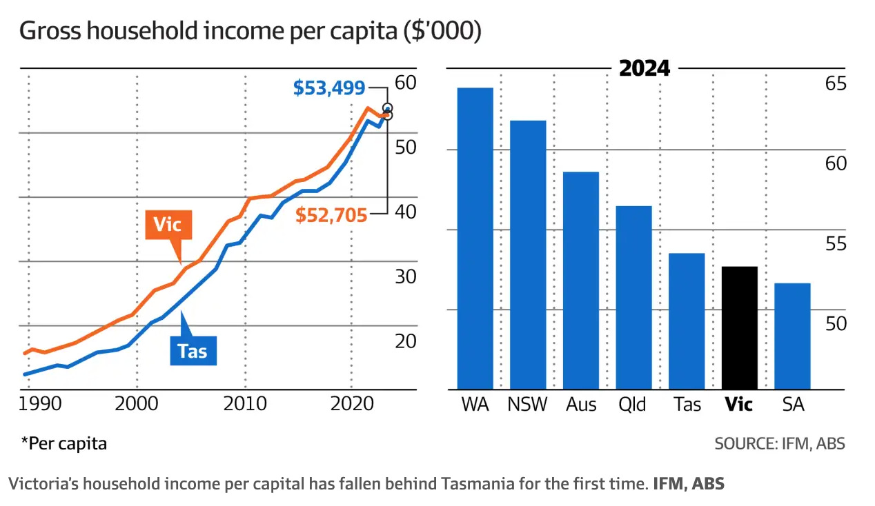
There have been two economic charts going semi-viral— or at least what counts as viral for ABS statistics—in the past couple of weeks. Both claim to show a dramatic fall in living standards in Victoria and Australia, respectively, over the past couple of years. Saul Eslake’s chart from the AFR shows that Tasmania's income now exceeds Victoria's, while Steven Hamilton’s shows a precipitous decline in living standards in Australia compared to other countries.
This doomer meme has even reached the highest office in the land, with Prime Minister Anthony Albanese being confronted with these statistics on Insights on Sunday morning.
However, unfortunately for the discourse—though fortunately for Australians as a whole—these charts are quire misleading. This is because these per capita measures are being significantly distorted by the major changes in immigration numbers over the past couple of years.
Stop Trying to Make Mean Happen
Average statistics, like those in the charts, calculate all the income in the economy and divide it by the total population. This approach usually works fine, assuming the composition of the population doesn’t change dramatically. However we've seen big changes recently, particularly with a surge in immigration since borders reopened after COVID, including a substantial increase in student immigration.
Students typically have very low incomes, even if they work part-time. Adding a group of low-income workers into the economy skews average income downward, even if the rest of the population is just as well off—or even getting richer.
To deal with this issue, we need to go beyond simple averages and look at statistics that adjust for changing population composition. For example, measures of the median wage, which better reflect the experience of a typical worker, are much less affected by a surge of low-income groups. Unfortunately, these statistics, which account for the full distribution of income, are more complex to calculate and so are published less frequently and less promptly. However, in today’s unusual economic circumstances—with significant swings in the post-pandemic economy—they are incredibly important.
The Limited Growth Does Not Exist
Looking at the labour market data from August 2023 (more timely data is not available until next week - I will update when it comes out!), it’s clear that Victoria still outperforms Tasmania when we focus on the median full-time wage. Even part-time workers in Victoria earn significantly more than their Tasmanian counterparts.
Furthermore, labour market data reveals the size of the distortion. When examining the share of the labour market that works part-time and has arrived in Australia in the past five years, Victoria stands out with a massive increase in the size of this group, driven by its high concentration of universities and foreign students. In contrast, Tasmania’s share of overseas part-time workers has barely changed and remains a small share of its labour market.
The alleged reversal of fortunes between Victoria and Tasmania is, therefore, mostly a statistical mirage. The typical Victorian is still much wealthier than the typical Tasmanian and has experienced a steady increase in nominal income, if not real income.
The same holds true for Australia when compared to other OECD countries. Australia’s economy is heavily reliant on its tertiary sector, which skews comparisons. When focusing on the experience of the median full-time worker, Australia’s situation appears far less dire. While inflation has eroded incomes somewhat, Australia has not seen the catastrophic decline in living standards suggested by the charts.
How important is this effect? Well Steven Hamilton’s chart depicts an 8 per cent fall in mean real disposable income in Australia, in contrast to growth of 3 per cent since 2022 in the US. Since that date the net change in visitors on a student visa in Australia is 600,000.
Using some back of the envelope calculations this surge would have increased the number of households by 5-6 per cent, while the increase in household disposable income would have been less than 0.5 per cent (based on the median wage earned by these part time workers). This suggests that more than half of the apparent decline in household income is a statistical mirage driven by the reopening of borders post Covid! By contrast the US, being a large, diverse economy with less severe border controls during Covid, has not seen as big a change in its labour market composition.
This is not to say that the high inflation rate and resulting rises in interest rates is not weighing on household budgets - but the picture is far less dire then these results suggest.
Average measures may be useful in stable conditions, but they are misleading when population composition changes rapidly. Median statistics, though less frequently highlighted, provide a more accurate view of the typical worker's experience, making them crucial for understanding economic conditions during this unusual period.


Awesome article! Can you confirm the data source for your median weekly wage chart?