Breaking down inflation
Supply, demand ... or ambiguous?
The San Francisco Fed has put out a note breaking down the rise in inflation to “Demand” or “Supply”. The intuition is quite simple: if a given good or service sees it’s price and quantity consumed unexpectedly rise in a given month it is classified as “Demand” induced shock. The same is true if they both fall. Any positive correlation between price and quantity is assumed to be driven by a “Demand” shock.
However if the price and quantity move in opposite directions in a given month it is classified as a “Supply” induced change. Price or quantity changes that are close to zero as classified as “Ambiguous”. There are some minor technical details (they regress each series on a time trend and lags to isolate the unexpected component of the monthly change) but at its heart it is very Micro 101 approach:
Replicating such an exercise for Australia is also pretty straightforward, although our data is more limited in both its frequency and granularity (monthly CPI cannot come soon enough!).
So what does it say is driving our current bout of inflation?
Before we get to the graphs we should start with a health warning: This exercise is very much a rough rule of thumb. Obviously a given good or service could be subject to both supply and demand shocks at the same time and the overall effect on prices and quantities will be determined by not only the level of supply and demand but their respective elasticities.
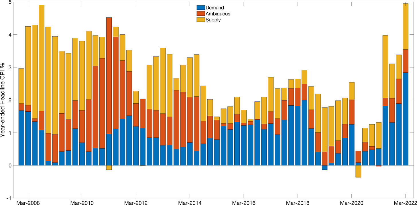
With that caveat here is what the year-ended results look like for Australia:
(There might be some errors compared to the total headline CPI rate due to rounding and my use of time-fixed weights when aggregating).
Before interpreting the results it is worth asking what the outcomes would look like for the economy if we were in normal times. For an economy in steady state we should expect to see total inflation close to 2.5%. We would also expect to see inflation spread over the three buckets (Supply, Demand & Ambiguous) in roughly equal measure as even random noise in the data will generate some price and quantity changes that are either positively or negatively correlated.1
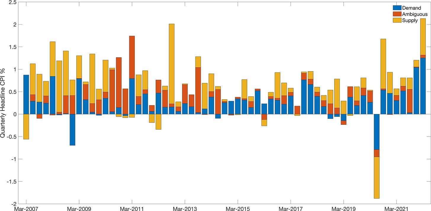
Looking are the quarterly numbers above I think there are three interesting takeaways:
This breakdown suggests that a substantial portion of the March 2022 inflation is driven by demand - as both prices and quantities increased across a range of goods.
Increasing supply was a big driver of the June 2020 deflation. This is counter intuitive but is driven by goods such as furnishings which saw large declines in price, but rises in quantity consumed. The model thus infers this as an increase in supply - even as we being locked down!
Examining the components over time we see that food and clothing are the most often “Supply” driven. The most “Demand” driven sectors are transport, health and recreation.
There are always caveats with this sort of simple exercise. But the fact that “Demand” driven inflation is currently at the highest rate on record - above even the rate we saw during the mining boom! - helps explain why the RBA’s tightening cycle is far from done.
The ambiguous category is defined such that it should included 36% of goods on average over time.


This is a good piece, thank you.
I'd been wondering the extent to which inflation was supply vs demand driven. And with so many external factors in play, I'd assumed is was predominantly supply side.
I've also been trying to get my head around the extent to which the RBA would end their current tightening if the drivers of inflation were to switch to predominantly supply side. My basic grasp of economics would say that increasing rates would have an effect on exchange rates, which might continue to help with price pressure on our imports. What are your thoughts on this?