

Oh Naur!
A worrying trend emerges

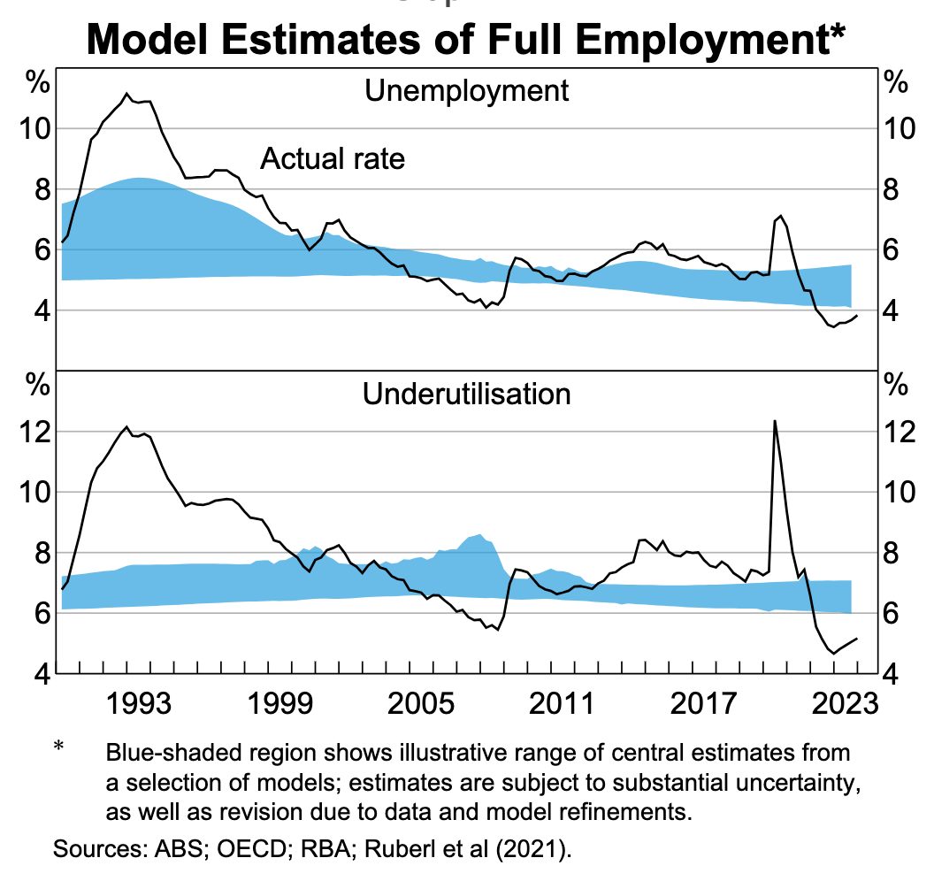
The RBA has done an admirable job of publishing its latest estimates of full employment in the Febuary Statement on Monetary Policy, detailing a variety of measures and estimates for what full employment might look like. They broadly find that the rate is holding steady and tracking somewhere around 4-5%.
Which was why I was surprised when I re-ran my copy of the NAIRU model1 and found that the latest estimates suggest the NAIRU is above 5% and trending upwards.

Quick aside: The NAIRU, the non-accelerating inflation rate of unemployment, only actually accelerates if expectations become unmoored. If expectations remain well anchored, and a substantial unemployment gap opens up, then you only see a level shift in the inflation rate according to this model.
So, what gives? Why is my version of the model producing such a pessimistic result?
4 per center
The last couple of quarters can broadly be described as the 4 per cent economy. The inflation rate has been humming along at an annualized pace of 4%, perhaps a touch higher, and the unemployment rate is around 4%, perhaps a touch lower.
Furthermore the supply-side factors which explained the high rate of inflation in 2022 have since dropped to more reasonable levels. Supply chain issues have mostly resolved over the past year or so, and the prices of imported consumption goods are longer pushing up prices as they once were.
Accordingly the model reasons that if supply chain factors are not keeping the inflation rate high, it must be demand. If it's demand, that must mean the unemployment rate is below the NAIRU. The longer this trend of above target inflation goes on the more the model thinks that the unemployment rate is below the NAIRU.
That seems to be a fairly reasonable assessment of the economy today to me. Strong inflation, reasonably low unemployment rates by historical standards, and most of the supply-side shocks seem to have dissipated.
The lady is not for turning
The RBA clearly doesn't believe this. In their most recent round of SMP forecasts, they still have the NAIRU at around 4.3%.
This is a example of models are often used not to illuminate but to communicate. When faced with a conflict between the previous set of assumptions and their beliefs about the state of the economy, the RBA often prefers to adjust their models and assumptions to provide a more stable and coherent message about their view of the economy. The RBA doesn't believe that the NAIRU is over 5%, so they've clearly changed some of the assumptions in the model preferring a realistic (or at least consistent) answer over a consistent set of assumptions.
How might the NAIRU model be altered to achieve this? There are a couple of plausible fixes.
The first is that inflation today is just a lot more persistent than it was historically. If you dial up the weights on lagged inflation in the model, then that would explain the high rate of inflation today without having to resort to a sizeable positive unemployment gap as the most likely explanation.
The second way to avoid this result would be to simply assume that the NAIRU is more stable over time (by narrowing the prior on the NAIRU drift term) and thus less likely to have risen suddenly over the past 18 months. If you tighten up this assumption, then mechanically the NAIRU will look a lot more constant, and this might well be enough to keep the NAIRU at its previous level of somewhere in the 4s.
The final possible explanation is that there is some sort of other supply-side shock somewhere in the economy that is not well approximated by either supply chain measurements or import prices. However, it's hard to imagine exactly what that series could be without a thorough exploration of the ABS website. Or at least, it's not obvious to me.
I can understand why the RBA does not want to show the public the messy details of how its models are built. Having an answer that flips around every 6 months or so is messy and hard to explain. Still, the most recent data does paint a worrying picture. If it is indeed true that the NAIRU has increased, even if by less than what my headline results suggest, then this would be quite a dire sign for the economy, and would involve having to increase our forecasts for the unemployment and inflation rates.
PS. You might also be interested in…
Stephen Kirchner’s substack on Australian economics! He also follows the most recent gyrations of the Australian economy. He is particularly knowledgeable about the history of Australian macro policy - and has been talking about the issues with LAW and monetary policy since before I joined the RBA!
Unfortunately, his substack is now going behind a paywall, though I believe there is a free trial option and discounts for student and those stuck in academia - though if you are willing to give him a plug on your own substack he has promised a year’s free content (while that nudge has affected the timing of this endorsement it has not affected the content)!
There are a couple of minor changes. We don't yet have the most recent increase in unit labor costs, which will come with the national accounts in a couple of weeks' time. I have also swapped out the previous measure of supply chain pressures for two dummy variables, which achieve much the same outcome.