The Rate that Doesn’t Rate
The RBA is leaning away from the unemployment rate as the primary measure of the labour market

In my last post I managed to stroll right past the most interesting chart, like a tourist in Sydney who takes 50 photos of the Opera House gift shop but forgets to look up at the sails. Consider this the belated follow-up.
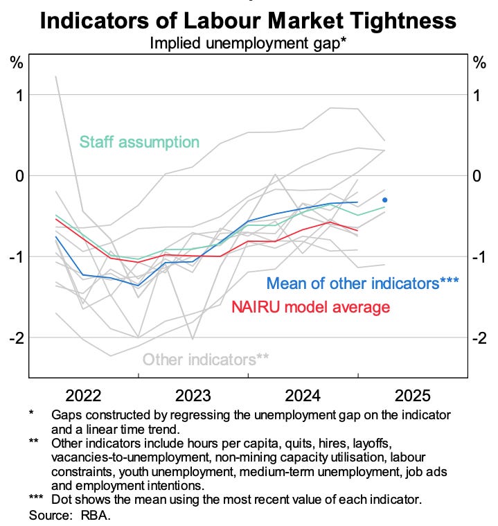
This chart shows the evolution of the staff assumption concerning the NAIRU over time, and how it has varied.
Through 2022 and the first half of 2023, the staff’s estimate (in teal) closely tracked the NAIRU model averages (in red). The RBA more or less took the models average output at face value - a fairly reasonable way of estimating the NAIRU!1
Since the second half of 2023, though, the two lines have diverged, with the staff NAIRU now sitting at least a quarter of a percentage point lower than the model averages. This is a result of the RBA applying judgement to the models’ output beyond what the core data suggests.
A reasonable interpretation of this chart is that the deviation from the model averages is being informed by a range of other indicators of the labour market. While the unemployment rate along points to a fairly strong labour market - other indicators suggest it closer to equilibrium.
This is a meaningful deployment of judgment. A 25 basis point deviation in the unemployment gap translates into roughly a 50 basis point difference in the nominal cash rate in the long run. Put differently, this staff assumption has led to interest rates being cut by around two to three times more than would have been the case had they stuck with their previous approach of hugging the model’s output.
So, has this been a successful deployment of judgment?
Who Judges the Judges?
There are two ways of assessing this. The first is to look at forecast accuracy: has assuming a lower NAIRU yielded a more accurate set of forecasts than would have occurred otherwise? Here the case looks fairly strong. Inflation over the past two years has decelerated faster than expected, suggesting that the lower NAIRU assumption, which implies less inflationary pressure, was a reasonable one.
The second approach is to consider how the model-estimated NAIRU has evolved over the past two years. If the staff judgment was correctly identifying the level of “full employment” in the labour market, then the models would eventually drift closer to the staff’s lower level of NAIRU.
In practice, the opposite has occurred. Since the third quarter of 2023, the estimated NAIRU has risen in almost every quarter. This suggests the staff judgment was not correct.
With this mixed picture of success, it is hard to say with certainty if the judgment was right or wrong.
How do we reconcile these apparently divergent results? In my opinion the simplest explanation is that demand-side inflation remains strong and the staff’s lower NAIRU call was misplaced, but that a series of expansionary supply shocks — or disinflationary cost-push shocks — have kept inflation low despite that strong demand. These factors have helped bring inflation back towards target even as unemployment has remained low.
As ever, this is only a partial read. The ultimate arbiter between these competing explanations, and of the success of the staff’s judgment, will be the future path of the data. The key question is whether these supply shocks fade and the models’ higher NAIRU estimates prove right, or whether the economy can, in fact, sustain low unemployment without reigniting inflation.
One thing it would be useful for the RBA to do is to clarify explicitly where it thinks the NAIRU sits today and what has informed their current deviation from the model based approach. When you look at market economists’ estimates of the NAIRU it is striking how much lower they are, often dramatically so. My guess is that many economists took their cues from when this was a hot topic of discussion a couple of years ago (and the unemployment rate was lower), and haven’t updated their views — partly because the RBA itself hasn’t revisited the subject as much, even though its own estimates have trended higher. Updating their estimates publicly would help market participants update theirs as well.
There was a slightly larger unemployment gap, indicating that the staff assumption was shading down their estimate of the NAIRU by a very small amount.
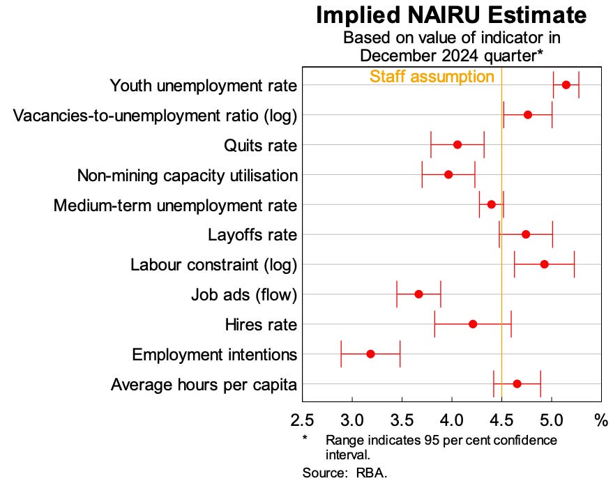
An important thing to consider is what the correlation between the NAIRU estimates and all these other indicators is. And, even more so, whether any divergence between these indicators and the NAIRU is useful for forecasting. That is, to the extent that they are useful, is it merely the degree to which they track the NAIRU?
My suspicion is that all these indicators are doing is adding noise to the assessment. Useful noise if you don't want to be tied down on what your estimate actually is, and even more so if you don't want to be accused of wanting to put people out of work; as the RBA was early in this Governor's tenure. But not so useful if you are trying to make accurate forecasts of the state of the economy and setting policy appropriately.
Edit: And having found the source document my suspicions are confirmed. From the note: "While some indicators suggest a lower NAIRU estimate than others, these tend to be series with a poorer fit (employment intentions, hires rate and capacity utilisation) or a short back history (job ads)." So taking a simple average puts undue weight on indicators that have a poor fit.
I guess time will tell.
(And I agree with your interpretation of the data - net demand is still strong and the current inflation rate flatters the RBA's choices.)